Navigating the Template Editor
If you don't already have an HTML format ready to paste or find it a hassle to use markup, PostGrid comes with its very own built-in editor. To use the editor, click the 'Build using Template Editor'.

Be sure to add a description, then hit 'Create' to continue.

Next, select a collateral type before continuing on to the editor. In this guide, we will focus on creating a letter (sized appropriately for Canada and the US), though options exist for creating postcards of various sizes. Once you have your collateral type selected, you are ready to move on to the editor.
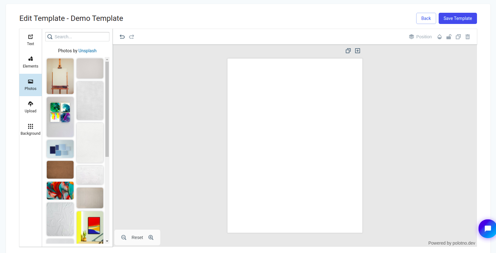
Once you are in the editor, we may immediately notice that our page is set up in the correct dimensions with elements along the left we may add to our blank canvas. Let's take a brief look at each feature in this intuitive drag-and-drop editor.
Basic Functions
Each element is added to the canvas by clicking on the desired element on the right hand-side. Once added to the canvas, you may modify the element in a variety of ways. Besides adding elements, you may zoom in or out of the letter without affecting the size of everything by using the magnifying glass icons in the bottom left. The 'Reset' button simply restores the amount of zoom to the default level.
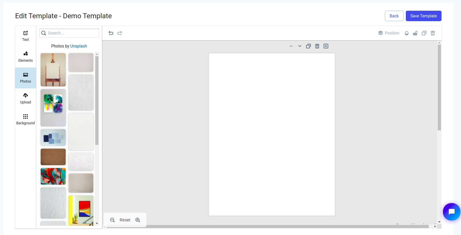
To add or duplicate the current page, use the icons in the top right corner. Navigating to different pages is as easy as scrolling or using the new arrow buttons which appear in the top-right corner, just above the page. Additionally, pages may be deleted by using the trashcan icon in the top right corner which appears once multiple pages are being used. Pictured below is what your editor should look like after a new page is added.
Adding Text
To add text, navigate to the text section to reveal some set examples of text elements to add.
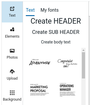
To add a given text element to you letter, simply click on the example. All examples are editable to put your own words in while retaining the styling.
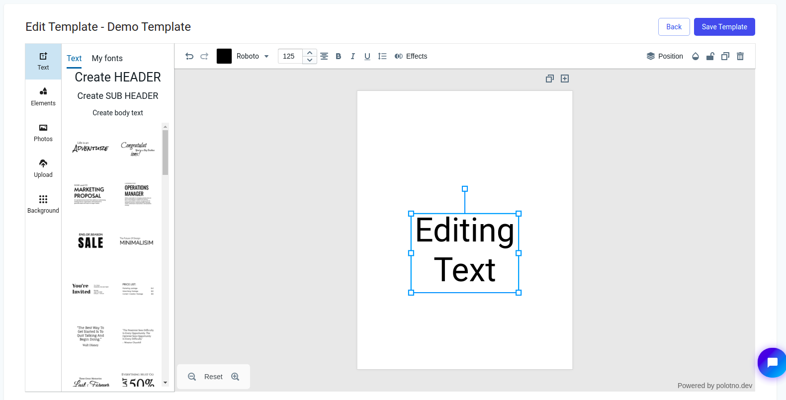
In the above example, we have selected 'Create HEADER' and put our own text into it. While editing text, note that along the top of the editor that we may now find our basic text editing options such as alignment, colour, font, font size, and more. If you'd like to use alternative fonts, note that you may upload a font by selecting 'My fonts', which resides on the top-left.
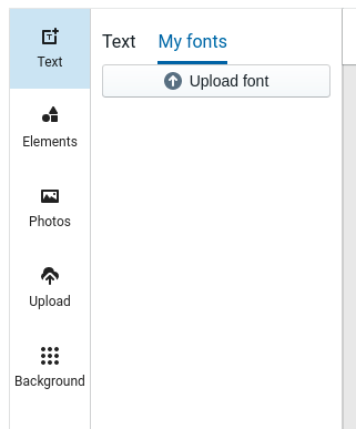
After selecting 'Upload font' and selecting your downloaded font, the downloaded font will appear below the upload button as so.
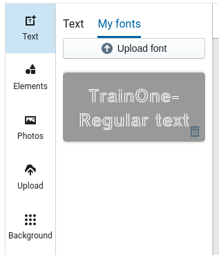
In this case, the font selected was 'TrainOne-Regular text', which can be downloaded from Google fonts.
Adding Images
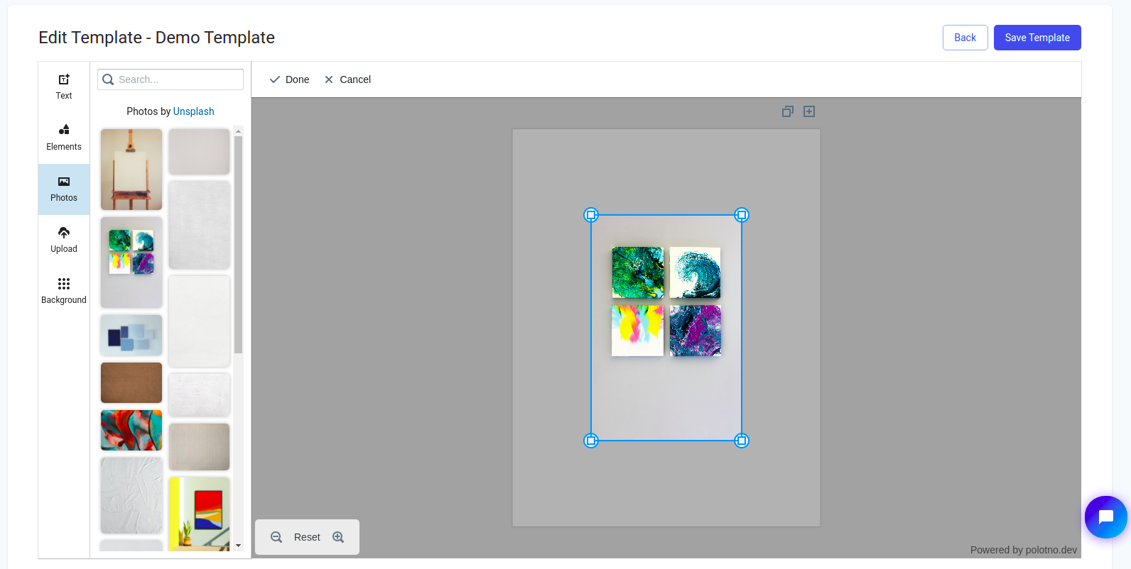
Aside from text, you would most likely want to add images. To add images to your canvas navigate over to the photos tab along the left-hand side.
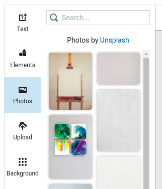
From here, simply click on the desired photo to add to the canvas.
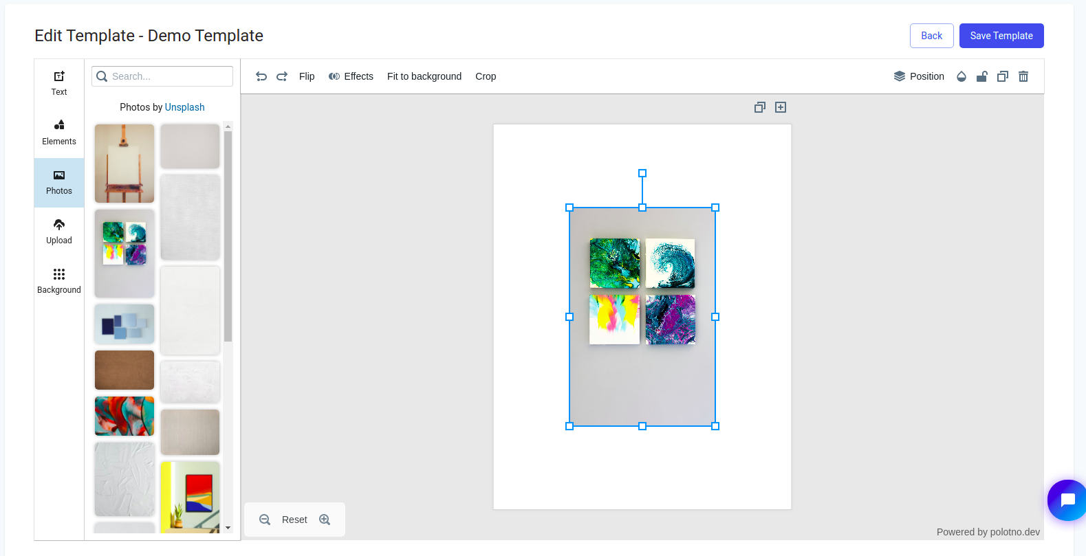
With your photo on the canvas and selected, notice that we have some new options compared to editing text. Unique to editing images, we are able to flip our image (horizontally or vertically), fit it to the background, as well as crop the image. You may also open the crop tool by double clicking on the photo.
If we wish to use our own images, navigate over to the 'Upload' tab found on the left.
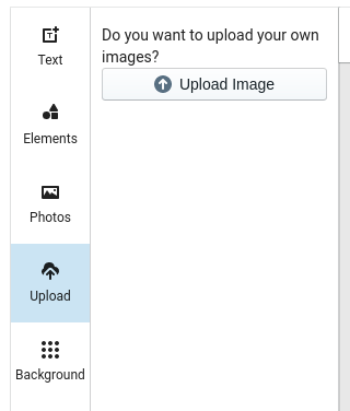
When you select an image, it will appear below the 'Upload image' button as so
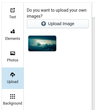
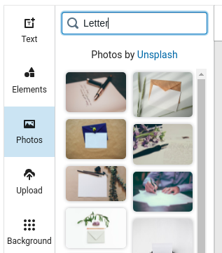
Simply click on the image to add it to your canvas and you will have access to the same options as we had for any other image. If you need to find a photo to add, you can use the search bar on the 'Photos' tab in order to find an image. As an example, here's what I found when I searched 'Letter'.
Adding Icons
In addition to adding images to the canvas, you may place a host of different customizable icons which can be found in the Elements tab.
If you are looking for a specific shape, you can use the search functionality to find what you are looking for. Here is an example of what you can find when you search for 'mail'.
Once your icon has been added to the canvas, some interesting customization options emerge.
Other than the 'Flip' functionality which behaves identically to that when editing photos, we may see a row of colors along the top. These colors constitute the palette used to color the icon and may be customized to your liking. Here is an example of the same icon with new colors.
Placing and Sizing
With elements on the canvas, it is easy to move them around and resize them to your desire. The simplest way to move the elements around the canvas is to simply click and drag and the element will follow your mouse. You may also use arrow keys on selected elements in order to move elements with more precision.
When using the mouse, the template editor comes with placement guides to help center images as well as line up along the edge.
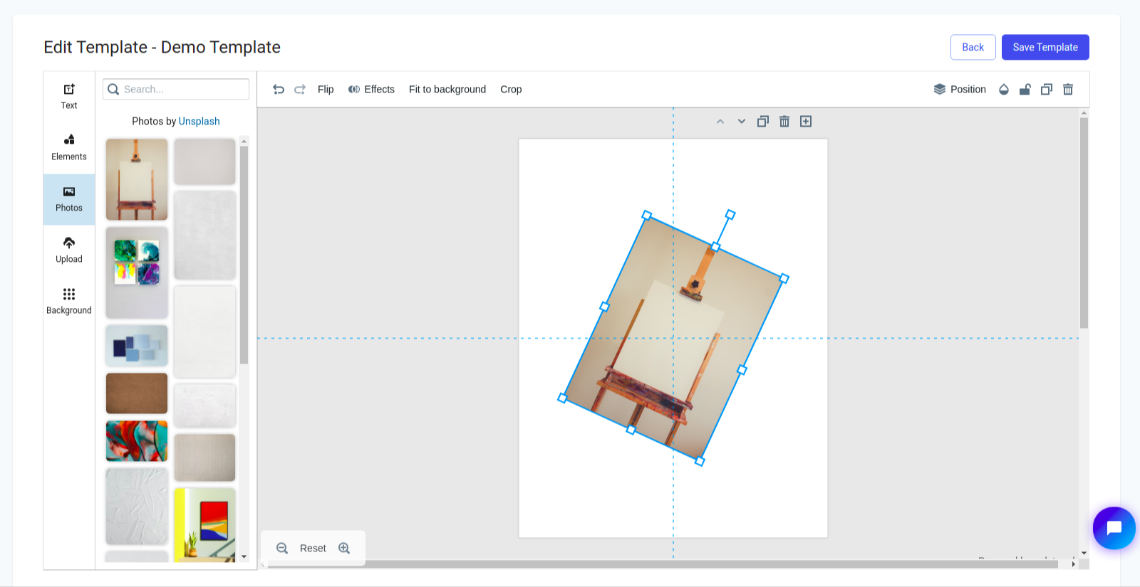
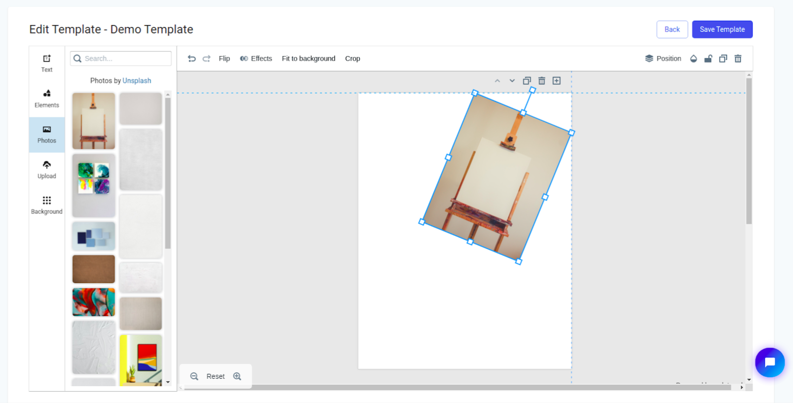
In addition to this, opening the position tab will reveal a host of other helpful position information as well as layer controls to change which elements appear above others.
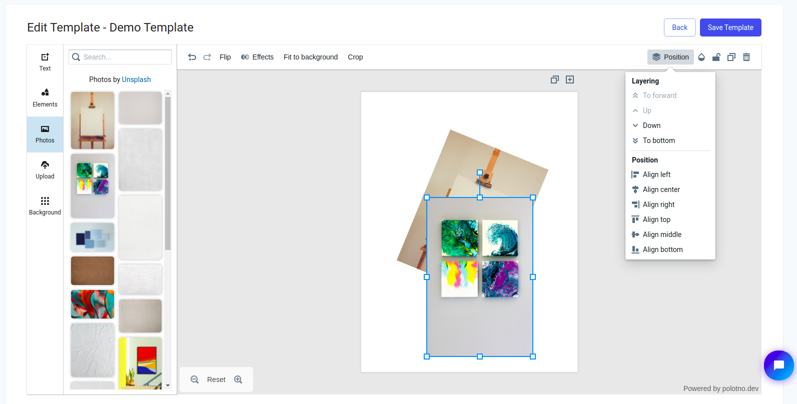
Also in the same area at the top-right of the editor are a few other helpful tools.
- The half-filled drop allows you to edit the transparency of the element
- The lock allows you to prevent further changes to the element and can be enabled or disabled
- The square-over-square icon duplicates the element
- The trashcan icon will delete the element, which may also be done using the backspace and delete keys.
Crucial to editing elements asides from the position is also the size and orientation. With an element selected, you may use the white squares found on the light-blue box around the icon in order to control the size. The box which extends along a line directly above the element allows you to control the rotation of the object.
Adding Effects
Finally, we arrive at further manipulations which can be done to the elements added to the canvas. Whether adding text, images, or icons, there exists the option to add effects.
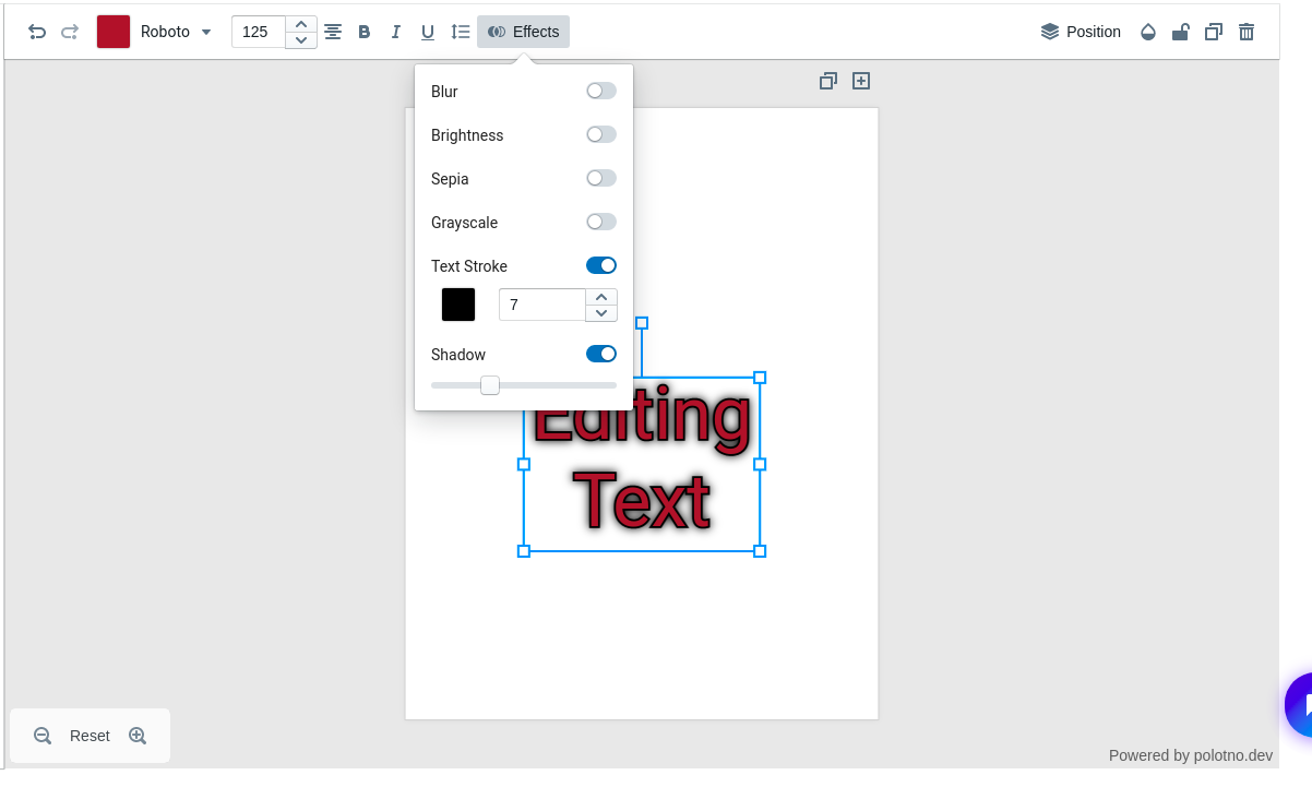
When editing text, we are given the following options:
- Blur: use a slider to determine amount to blur the text
- Brightness: use a slider to change the brightness of the text color
- Sepia: toggle a sepia filter over the text
- Grayscale: toggle a grayscale filter over the text
- Text Stroke: Select a color and width of outline around text
- Shadow: use a slider to determine the size of shadow behind the text
For photos and icons, the effects options and functionality is nearly identical except for 'Text Stroke' which is replaced by border, sharing a color and width selector. For icons, shadows follow the outline of the icon and not just behind the icon as it behaves for pictures. The border will be rendered on the inside of the light-blue rectangle around the icon which appears when you select the icon to edit.
